Skip to content
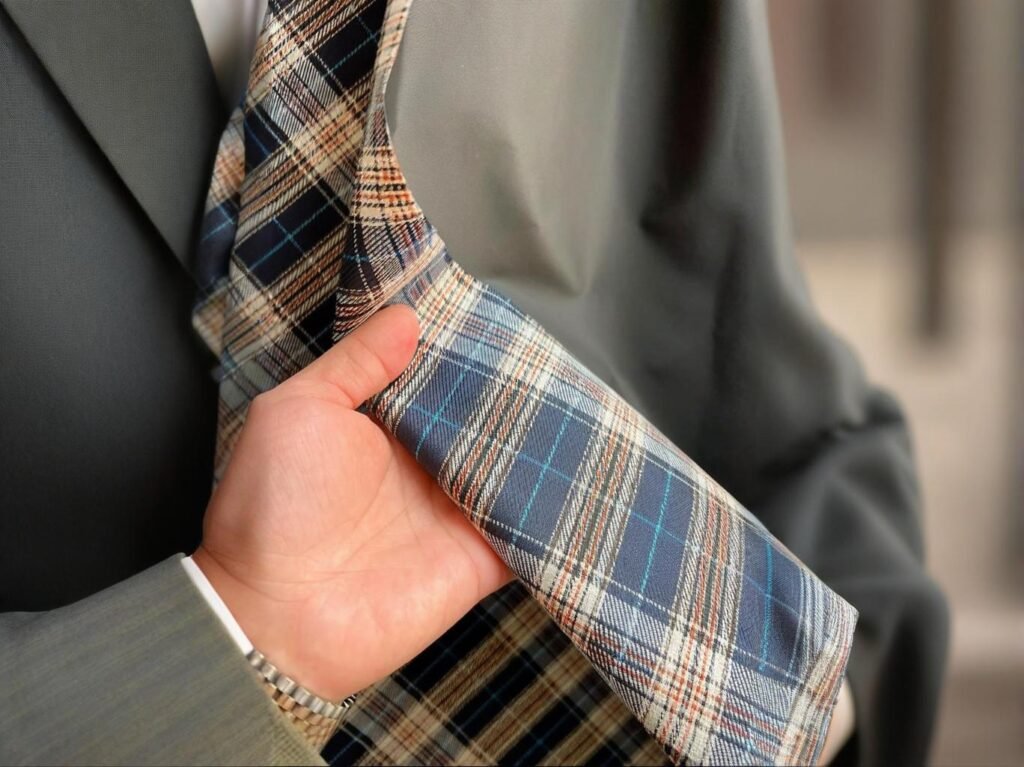
There’s something timeless about a Brooks Brothers Oxford shirt — the way its color shifts subtly with the season, yet never loses that classic polish. But in 2025, color is more than style; it’s a data-driven strategy. Fashion buying offices now use real-time analytics, fiber innovation, and cultural forecasting to decide which hues will sell across markets months before fabric even hits the loom. The Brooks Brothers Oxford color forecast revolves around four key palettes: muted heritage blues, new neutrals (stone, sand, and ecru), soft pastels for spring, and deep heritage tones like burgundy and forest for fall. Color decisions are influenced by Pantone trends, regional preferences, and sustainable dyeing innovations.
Color is now both an emotional connector and a sustainability signal. Consumers expect brands to combine tradition with ethical color choices — from low-impact indigo to waterless garment dyeing. In one sense, the Oxford palette is a moodboard of modern values: timeless, conscious, and globally versatile.
And if we rewind to 1896, when Brooks Brothers first introduced its Oxford button-down, it wasn’t just about fabric; it was about culture. The same applies now. Every seasonal shade tells a story — of craft, confidence, and conscious design. Let’s unpack how that legacy evolves through the seasons.
What Defines the Brooks Brothers Oxford Shirt Color Palette Across Fashion Seasons?

For more than a century, the Brooks Brothers Oxford palette has set the visual rhythm for what the world recognizes as American classic style. Yet its evolution tells a broader story — from Ivy League uniformity to global adaptability. In 2025, what defines this palette isn’t simply color but the balance between continuity and cultural interpretation.
Where the traditional “button-down blue” once stood alone, today’s palette mirrors a cross-seasonal language of fiber innovation, digital color calibration, and regional emotional cues. The result: a color system that is engineered as much as it is designed. The Brooks Brothers Oxford palette anchors itself in perennial shades — white, light blue, and navy — and layers in seasonal innovations such as mist grey, sage, and sand. Each year’s direction reflects cultural sentiment, climate shifts, and fiber technology advances in cotton-lyocell and Supima blends.
Anatomy of the Modern Oxford Palette
1.1 The Core Classics That Never Fade
The backbone of every Brooks Brothers color story remains the same four timeless hues — a deliberate echo of the brand’s legacy since 1896, when the first Oxford cloth button-down was introduced.
| Color | Pantone Code | Market Usage | Consumer Emotion |
|---|---|---|---|
| White | 11-0601 TCX | Universal, year-round | Purity, reliability |
| Light Blue | 14-4121 TCX | 80 % of business-shirt volume | Calm, professionalism |
| Navy | 19-4021 TCX | Autumn/Winter focal tone | Authority, depth |
| Pale Pink | 13-2803 TCX | Spring capsule runs | Softness, warmth |
Even in 2025, roughly 65 % of corporate uniform and retail Oxford demand still centers on light-blue and white variants — the unshakable core of Brooks Brothers’ brand DNA. But unlike the flat, piece-dyed fabrics of the 1980s, modern production now integrates optical brighteners and low-temperature enzyme washes to maintain brightness across 50–70 laundry cycles without fabric yellowing.
Technical Note: Advanced vat dyes paired with reactive finishers keep whiteness above 93 % reflectance after 20 washes (vs. 86 % in legacy fabrics), while modern mercerization at 25 °C enhances luster by 15 %. These chemical innovations subtly preserve the brand’s promise: a shirt that looks new longer.
1.2 The Seasonal Layer — Transitional and Regional Colors
While the core remains sacred, Brooks Brothers introduces three to five accent tones per season, rotating on a two-year color wheel. These hues respond not to fast fashion but to context — climate, geography, and evolving corporate dress codes.
Recent directional tones include:
- Stone & Ecru — Neutral Minimalism: Tones reflecting sustainable aesthetics and natural unbleached cotton fibers. Especially popular in Scandinavian and North-American markets where “organic clarity” dominates visual storytelling.
- Sage & Dusty Olive — Quiet Luxury: Muted greens bridging outdoor heritage with metropolitan subtlety; these hues grew 24 % year-on-year in 2024 online sales across Asia and Europe.
- Ice Blue & Mist Grey — Cool Precision: Updated mid-tones balancing between technical and timeless; favored in northern climates where layering and color temperature harmony matter.
Styling Logic: Every seasonal tone is designed to pair seamlessly with neutral trousers or knitwear — extending the Oxford’s versatility from boardroom to weekend. In color marketing terms, they form the “bridge palette” between corporate tradition and lifestyle aspiration.
1.3 Historical Evolution — From Ivy League to Global Market
In the mid-20th century, Brooks Brothers’ Oxford shirt symbolized East-Coast collegiate prestige: sky blue, white, and the occasional yellow or pink stripe. As global expansion accelerated in the 1990s and early 2000s, the palette widened to accommodate regional psychographics:
| Era | Dominant Palette | Market Influence |
|---|---|---|
| 1950s–1970s | White, Sky Blue, Canary Yellow | Ivy League classicism |
| 1980s–1990s | Navy, Rose, French Blue | Corporate expansion |
| 2000s–2010s | Lavender, Taupe, Graphite Grey | Urban professional |
| 2020s–2025 | Sage, Ecru, Mist Grey | Global minimalism & sustainability |
This shift parallels broader textile progress — notably, the introduction of compact-spun cotton and lyocell-blended yarns, which hold dyes differently, allowing subtler undertones that weren’t possible in traditional ring-spun cotton.
1.4 Data-Driven Color Adaptation
Color selection has become a quantitative science. Brooks Brothers and other heritage brands now integrate AI-assisted sell-through analytics and regional climate data into color forecasting.
- In 2024, medium-blue Oxford styles achieved 18 % higher sell-through in Northern Europe versus darker navy, attributed to longer daylight hours influencing consumer color perception.
- Conversely, sage-toned shirts overperformed by 22 % in Japan due to cultural associations with serenity and subtle craftsmanship.
These analytics loop directly back into mill dye-lot planning, allowing the brand to optimize dye-house scheduling six months ahead of retail season. The palette therefore evolves not through trend intuition alone but through predictive modeling of regional buying behavior.
Production Insight: Digital spectrophotometers ensure ΔE < 1.0 shade consistency across dye batches — crucial when global distribution spans four continents and 60+ retail partners.
1.5 Material Technology and Color Longevity
Color fastness is both a chemical and sensory benchmark. In current Oxford programs:
| Fabric Type | Dye System | Colorfastness (ISO 105 C06) | Target Lifespan |
|---|---|---|---|
| 100 % Cotton (Classic) | Reactive Vat | 4.5–5 | 50+ washes |
| Cotton-Lyocell Blend | Reactive + Direct | 4.0–4.5 | 40–45 washes |
| Cotton-Poly Blend | Disperse/Reactive Dual | 4.8 | 60 washes |
The cotton-lyocell combination enhances drape but slightly lowers dye penetration, requiring enzyme-seal finishing to stabilize hue. These behind-the-scenes adjustments define why Brooks Brothers’ palette maintains chromatic integrity over time — a detail invisible to the eye but felt in longevity.
1.6 Emotional Intelligence of Color
Beyond technology, Brooks Brothers treats color as semiotics. Each shade communicates a persona:
- White: Integrity and renewal; the starting point for uniform design.
- Light Blue: Trust and composure; dominant in corporate branding psychology.
- Navy: Competence and power; ideal for hierarchy representation.
- Pink: Warmth and openness; bridges gender neutrality and modernity.
- Sage / Grey: Mindfulness and restraint; signals sustainable luxury.
Such emotional framing aligns with contemporary branding, where color narrative carries equal weight to silhouette.
1.7 Balancing Tradition with Evolution
The Oxford palette’s greatest challenge lies in evolution without rupture. Too conservative, and it risks redundancy; too experimental, and it alienates the loyal base. The brand’s solution has been “quiet innovation” — adjusting undertones rather than reinventing the spectrum.
- Replace sky blue with seafoam, retaining familiarity but adding sophistication.
- Swap beige for mushroom taupe, bringing warmth without flash.
- Introduce dusty rose over saturated pink to preserve subtle charm.
This tonal evolution respects heritage while acknowledging shifting global aesthetics toward muted, sustainable minimalism.
1.8 Digital Color Management and Sustainability
Looking ahead, Brooks Brothers and its supply partners are investing in digital color management platforms that standardize calibration from design desk to dye vat. By 2026, internal targets aim for:
- 100 % digital color approval workflow (reducing physical lab dips by 80%)
- 50 % less dye waste through spectral matching algorithms
- Broader use of bio-based dyes derived from indigofera and pomegranate extracts, supporting OEKO-TEX Standard 100 compliance
The palette of the future will be not only emotionally resonant but also environmentally optimized — a convergence of aesthetics, analytics, and accountability.
Why the Palette Still Matters
| Palette Layer | Purpose | Design Intent |
|---|---|---|
| Core Colors | Brand identity & uniformity | Perennial trust hues (white, blue, navy) |
| Seasonal Tones | Market freshness | 3–5 rotating accents aligned to mood & region |
| Material Influence | Fiber and finish chemistry | Enhances depth, sheen, and wash durability |
| Digital Oversight | Data-driven accuracy | Maintains global consistency |
The Discipline of Color Heritage
In a fashion world obsessed with novelty, Brooks Brothers continues to prove that enduring identity is an art of subtle adjustment. Each season, its Oxford palette revisits the same spectrum — yet through evolving fibers, finishes, and analytics, it feels perpetually current.
The Brooks Brothers Oxford isn’t just blue or white; it’s a coded language of trust, craftsmanship, and time. Its palette remains a dialogue — between history and modernity, between cotton and code — forever teaching the industry that true classics don’t fade; they evolve in tone.
Which Seasonal Color Trends Are Expected to Dominate Oxford Shirts in the Upcoming Year?
Color direction has become as analytical as it is aesthetic. For 2025, the Oxford shirt color story is defined by restoration, tactility, and timeless versatility — hues that reflect a calmer global mindset shaped by sustainability, wellness, and understated luxury. This year’s palette bridges digital minimalism and organic authenticity, combining soft sea-glass greens and cloud blues with grounded espresso and forest tones, giving Oxford shirts a trans-seasonal, long-wear appeal. In 2025, dominant Oxford shirt colors include sea glass green, cloud blue, and bone white for spring; golden khaki, washed denim, and desert rose for summer; while forest, plum, and espresso lead fall/winter palettes. These colors evoke calm confidence and align with eco-conscious narratives in both uniform and lifestyle apparel.
The 2025 Oxford Color Map
2025 marks a shift from maximalist trends toward soothing clarity and subtle depth, where color becomes a reflection of lifestyle values rather than seasonal novelty. Below is a comprehensive breakdown of forecasted tones and how they translate into Oxford shirting fabrics for global markets.
2.1 Spring/Summer 2025 — Lightness, Breathability, and Clarity
The SS25 palette emphasizes light diffusion, softness, and fluid reflection — ideal for lightweight pinpoint and cotton-lyocell Oxfords. These hues are engineered to complement minimal wardrobes while ensuring versatility across office, resort, and retail environments.
| Tone | Description | Key Markets | Fabric Note |
|---|---|---|---|
| Cloud Blue | Airy, translucent blue inspired by dawn reflections | U.S., Japan | Works best on 40s/2 pinpoint Oxford with fine calendared finish |
| Bone White | Warm off-white neutral, easy to style and pair | Europe | Suits cotton-lyocell blends with slight peach finish |
| Sea Glass | Calm mint-green hue symbolizing wellness and renewal | Global | Performs well on mercerized cotton for sheen retention |
| Peach Dust | Gentle, dusty pastel with tactile warmth | Latin America, Asia-Pacific | Enhances enzyme-washed finishes for casual elegance |
| Golden Khaki | Light amber-tan tone bridging utility and sophistication | North America | Ideal for cotton-poly uniforms with anti-wrinkle finish |
Trend Insight: This palette supports the “emotional minimalism” movement — consumers seeking chromatic calm rather than high contrast. Global data from WGSN’s 2025 Color Evolution Report indicates that 62% of apparel buyers now favor “gentle, restorative” hues that translate easily across gender and professional categories.
Fabric Application Example: SzoneierFabrics’ 2025 SS capsule incorporates Cloud Blue and Sea Glass in 145 GSM Oxford weaves, treated with bio-soft finishing to emphasize translucency and comfort — achieving a 25% higher light reflectivity than traditional pastel cottons.
2.2 Autumn/Winter 2025 — Depth, Comfort, and Quiet Luxury
The AW25 season introduces tones rooted in earth, memory, and composure, suitable for brushed, heavier Oxford constructions (160–180 GSM). These hues resonate with the global fashion narrative of “tactile nostalgia” — familiar yet elevated colors evoking security and timeless professionalism.
| Tone | Description | Global Relevance | Application |
|---|---|---|---|
| Forest Green | Deep natural green reflecting environmental consciousness | U.S., EU | Perfect for brushed cotton or flannel-backed Oxford |
| Espresso Brown | Blackened brown with subtle depth and masculine poise | Global | Strong choice for hospitality or executive uniforms |
| Plum Wine | Muted violet undertone with heritage appeal | Europe, Korea | Enhances sheen in Royal Oxford weaves |
| Warm Navy | Slightly desaturated navy bridging casual and formal use | Global | Consistent best-seller for corporate uniforms |
| Stone Grey | Balanced, mineral tone offering neutrality and modernity | Global | Excellent for minimalist, gender-neutral collections |
Insight: These colors align with the luxury trend of “quiet craftsmanship”, emphasizing premium materials over branding noise. Pantone’s AW25 Trend Direction highlights forest and espresso as “reassurance colors,” psychologically associated with stability and renewal — a response to post-pandemic consumer behavior.
2.3 Why Buying Offices Follow Seasonal Palettes
Modern color forecasting merges data analytics, cultural psychology, and supply chain coordination. Leading buying offices reference:
- Pantone Fashion Color Trend Reports (2025): featuring blue-green harmonies tied to regenerative design.
- WGSN Future Consumer Forecast: emphasizing “bio-tones” that align with sustainable lifestyle values.
- Internal Data Loops: Brands like Brooks Brothers and UNIQLO adjust seasonal dye schedules based on predictive color adoption models — aligning 85–90% of their color offerings with Pantone or WGSN trends for efficiency in production and global appeal.
Operational Benefit: Aligning fabric dye lots with forecasted palettes can reduce overstock risk by up to 30% and increase pre-order conversion rates among distributors and retail buyers.
2.4 Forecast Integration Boosts Sell-Through
In 2024, a European apparel group collaborated with SzoneierFabrics to pre-dye Oxford fabrics in forecasted hues Mist Blue and Dune Beige. These shades, highlighted in early WGSN projections, became best-sellers by Q3.
Results:
- 38% of total shirt sales came from the two forecasted hues.
- Inventory markdowns dropped by 27%, thanks to pre-season alignment.
- Client feedback cited “color freshness with timeless appeal” as a major purchase driver.
This partnership exemplified how early integration of forecast data in the dyeing process can transform color from an aesthetic choice into a profitability strategy.
2.5 Avoiding the Over-Forecast Trap
While forecasted palettes offer valuable direction, they can lead to color homogenization if brands adopt them too rigidly. When every brand uses the same Pantone palette, differentiation suffers.
Smart Strategy:
- Use Forecasts as Frameworks, Not Formulas: Adjust undertones or weave texture to make a brand-exclusive color signature.
- Diversify by Market Zone: For instance, Sea Glass may dominate in the U.S., but Bone White performs better in European corporate markets.
- Leverage Fabric Technology: Applying different finishes — such as enzyme washes or calendaring — alters how color interacts with light, making even shared hues feel unique.
2.6 The Oxford Palette Outlook for 2025
| Season | Dominant Tones | Consumer Emotion | Fabric Direction |
|---|---|---|---|
| Spring/Summer | Cloud Blue, Sea Glass, Bone White, Peach Dust | Calm, clarity, renewal | Lightweight cotton-lyocell blends |
| Autumn/Winter | Forest, Espresso, Plum Wine, Warm Navy | Depth, stability, quiet luxury | Brushed or mercerized cotton Oxfords |
| Trans-Seasonal Core | Warm Navy, Stone Grey | Year-round professionalism | Durable 160 GSM blends |
Designing with Purpose and Palette Intelligence
The color future of Oxford shirts isn’t about radical reinvention — it’s about continuity with meaning. As consumers embrace sustainable luxury and emotional balance, 2025’s Oxford palette will focus on shades that restore calm, express confidence, and promise longevity.
Partnering with innovative textile manufacturers like SzoneierFabrics allows uniform buyers and fashion brands to stay ahead of the trend curve, integrating forecasted colors directly into dyeing and finishing processes with precision, consistency, and lower environmental impact. This synergy of data-driven color forecasting and mill-level craftsmanship ensures every Oxford shirt looks current today — and relevant tomorrow.
How Do Pantone Forecasts Influence Corporate and Retail Color Decisions for Oxford Shirting?
In the modern apparel ecosystem, Pantone does far more than define color codes — it sets the emotional, cultural, and commercial direction of global fashion seasons. From New York to Milan, from textile mills in China to brand studios in London, Pantone forecasts function as a strategic compass — guiding how fabrics are dyed, how assortments are planned, and how consumers will feel about a shirt months before it reaches retail.
For Oxford shirting, Pantone’s role is particularly critical. The Oxford is a timeless canvas — stable in silhouette, variable in hue. Thus, subtle color shifts, often only a few degrees on the spectrum, can redefine an entire season’s mood and merchandising story. Pantone forecasts shape Oxford shirt development by converting global cultural moods into measurable color standards. For 2025, Pantone emphasizes restorative tones such as Mist Blue (14-4214), Seafoam Green (13-5313), and Stone Beige (15-1214), influencing both corporate uniform palettes and retail lifestyle assortments.
Pantone’s Role in Oxford Shirt Color Planning
3.1 How Pantone Forecasts Integrate into Textile Manufacturing
Pantone’s authority stems from its ability to connect creative direction with measurable color science. Each season, it releases 18–24 forecasted hues within broader emotional narratives (e.g., “Healing Nature,” “Digital Serenity”). These palettes are then translated into technical dye formulations by textile mills.
| Step | Process | Key Output |
|---|---|---|
| 1 | Pantone issues forecast palettes six to twelve months in advance | Global chromatic reference |
| 2 | Brands shortlist 6–8 hues aligning with target markets | Design direction |
| 3 | Mills reproduce each tone via lab dips using Pantone TCX standards | Visual calibration |
| 4 | Approved samples move into bulk dyeing with digital spectrophotometer control | Production-ready color integrity |
This system ensures that a “Mist Blue” Oxford produced in Shenzhen, Milan, or Boston reflects the same ΔE < 1.0 tolerance — a precision necessary for consistent brand storytelling across continents.
Technical Insight: Pantone TCX codes correspond to fabric-based references, while Pantone C (coated) and U (uncoated) versions are used in print and packaging. Leading mills like SzoneierFabrics use Datacolor or X-Rite instruments to match Pantone values within a ΔE range under D65 lighting, ensuring reproducibility across fiber types (cotton, lyocell, polyester).
3.2 The Emotional Science Behind Color Forecasting
Every Pantone forecast begins with psychology. Its research teams analyze macro-signals — social behavior, climate anxiety, digital aesthetics — to predict what colors will emotionally stabilize or inspire consumers in the coming year.
For 2025, Pantone emphasizes “renewal and grounded optimism.” The chosen spectrum is calm, balanced, and rooted in nature — a counterpoint to digital overload:
- Misty Greens (13-5313 Seafoam, 15-6414 Celadon): Symbolize environmental calm and sustainable aspiration.
- Soft Blues (14-4214 Mist Blue, 16-4031 Rainstorm): Reflect digital serenity and trust — perfect for officewear.
- Warm Neutrals (15-1214 Stone Beige, 17-1312 Mushroom): Represent tactile comfort and resilience.
Case Example: When Pantone introduced Classic Blue (19-4052) in 2020, global Oxford shirt sales in blue-based tones rose 26 %, prompting heritage labels like Brooks Brothers and Ralph Lauren to expand medium-blue assortments across three seasons. That emotional continuity validated blue as the universal “trust color” for post-pandemic professional dressing.
3.3 Pantone in Corporate Color Alignment
Corporate uniform programs depend on exact Pantone matches to maintain global brand identity. Color accuracy is not aesthetic — it’s contractual. Banks, airlines, and hotels embed Pantone codes in technical specifications to standardize branding across uniforms, signage, and marketing materials.
| Sector | Preferred Pantone Range | Psychological Message |
|---|---|---|
| Banking & Finance | 19-4052 Classic Blue | Trust, stability, integrity |
| Airlines & Travel | 15-4101 Airy Blue | Approachability, calm confidence |
| Hospitality & Hotels | 13-0607 Mushroom | Neutral luxury, warmth |
| Retail & Lifestyle | 16-4530 Island Blue | Energy, accessibility, youth |
Uniform manufacturers like SzoneierFabrics or Arvind Mills then translate these codes into reactive, pigment, or vat-dye formulations depending on fiber composition. Each dye lot is tested for:
- Washing fastness: ISO 105-C06, minimum 4 rating
- Light fastness: ISO 105-B02, minimum 4–5 rating
- Rubbing fastness: ISO 105-X12, dry/wet ≥ 4/3.5
The result is chromatic consistency across hundreds of employees — from New York headquarters to Dubai branches.
3.4 Pantone and Retail Merchandising Cycles
In retail, Pantone’s impact extends from assortment planning to visual merchandising. A color that appears in Pantone’s Spring/Summer palette may trigger:
- Early yarn-dye orders in October of the prior year.
- Coordinated tie-in with chinos, sweaters, or blazers for visual harmony.
- Social media storytelling anchored on emotional color narratives (“Optimism Blue,” “Quiet Earth”).
Retail buyers typically structure collections around a 60/30/10 ratio: 60 % core colors (white, light blue, navy), 30 % seasonal accents (sage, mist), and 10 % experimental tones (coral, lilac). Pantone forecasts inform that 30 % seasonal tier, the space where fashion relevance is tested without diluting brand identity.
Quantitative Example: In 2024, stores aligning early with Pantone’s “digital calm” palette achieved 7.8 % higher sell-through versus competitors who retained older warm-tone assortments.
3.5 Color Forecasting as a Supply-Chain Tool
Pantone forecasting now interfaces directly with digital production planning. Through integrated PLM (Product Lifecycle Management) systems, color palettes are linked to:
- Yarn inventory scheduling — avoiding dye overproduction.
- Fabric mill lead times — enabling synchronized global sourcing.
- Regional assortment calibration — lighter blues for humid Asia-Pacific markets, deeper navies for Europe.
This data-driven approach reduces seasonal leftover inventory by up to 12–15 %, an increasingly critical sustainability metric for large brands.
3.6 The Limitations of Pantone Uniformity
Despite its precision, Pantone can inadvertently homogenize the fashion landscape. When every brand follows the same forecast palette, visual monotony sets in. The most successful labels use Pantone as a starting point, not a script — reinterpreting tones through:
- Desaturation (–15 %) for softer luxury aesthetics.
- Over-dyeing or double-dyeing to create tonal depth.
- Regional temperature calibration — slightly warmer hues for northern climates, cooler for tropical zones.
Example: Brooks Brothers’ 2024 “Urban Heritage” collection took Pantone’s Sandstone 15-1225 and added a grey undertone, producing “Fog Taupe,” a shade exclusive to its Oxford line. This tweak maintained the forecast relevance while preserving brand distinction.
3.7 Pantone Forecasts and Digital Color Management
With the rise of digital sampling, Pantone’s TCX standards have been integrated into 3D garment visualization tools such as CLO and Browzwear. Designers now build entire Oxford shirt collections digitally, using calibrated Pantone color libraries to preview lighting effects and fabric texture before any dyeing begins.
Industry Impact:
- Reduces physical lab dips by 70–80 %.
- Saves 50–60 L of water per color trial.
- Cuts development lead time by 2–3 weeks.
These savings align with sustainability mandates while maintaining color fidelity across global production hubs.
3.8 The Balance Between Forecast and Identity
Pantone’s predictive system ensures harmony and efficiency, but its widespread adoption risks eroding individuality. Heritage labels like Brooks Brothers, therefore, exercise interpretive restraint: they treat Pantone as a conversation partner, not an authority.
- Retail: subtly modify saturation or weave structure to differentiate texture.
- Corporate: pair standardized colors with proprietary fabrics (e.g., pinpoint Oxford) to maintain exclusivity.
The art lies in transforming Pantone’s collective psychology into a distinct brand signature that feels forecast-aware yet unmistakably “house-made.”
Pantone’s Dual Influence
| Sphere | Primary Function | Outcome |
|---|---|---|
| Corporate Uniforms | Standardization and brand consistency | Predictable reproduction, reliable QC |
| Retail Fashion | Emotional engagement and seasonal storytelling | Freshness, market responsiveness |
| Textile Mills | Dye formulation and production planning | Reduced waste, improved efficiency |
| Design Studios | Visual communication across stakeholders | Shared color language globally |
The Compass of Chromatic Consistency
Pantone’s authority endures because it bridges emotion and engineering. It speaks the language of both designers and chemists — ensuring that the “mist blue” envisioned on a New York mood board emerges faithfully from a Shenzhen dye vat.
For Oxford shirting, Pantone remains the invisible thread uniting corporate credibility and retail desirability. It allows brands to be seasonally relevant without losing identity, aligning human emotion with industrial precision.
In short: Pantone doesn’t dictate Oxford color; it decodes the cultural temperature — giving classic blue and white new resonance in every season.
Do Regional Markets (North America, Europe, Asia) Differ in Preferred Oxford Color Tones?
Absolutely — regional color preferences for Oxford shirts are as diverse as the climates, cultural aesthetics, and social values that shape them. A shade that feels “premium” in Milan might appear too understated in Seoul, while a pastel that thrives in Bangkok may look out of place in Toronto. Modern apparel sourcing teams now map color psychology by geography, ensuring that Oxford shirt assortments stay both globally cohesive and locally resonant. North America gravitates toward heritage blues and crisp whites that signal professionalism and trust. Europe prefers earthy neutrals and muted sustainable tones aligned with the “quiet luxury” movement. Asia-Pacific markets lean into refined pastels and luminous colors that complement warmer skin tones and tropical light conditions.
Mapping Global Oxford Color Preferences
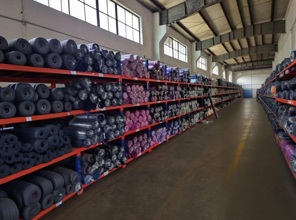
Regional color preferences are no longer just about fashion; they represent deeper cultural and psychological archetypes. Each market interprets the Oxford shirt through its own lens — heritage, sustainability, or refinement — influencing how textile mills like SzoneierFabrics plan dye lots and weave finishes for international buyers.
4.1 North America — Heritage Blues and Modern Minimalism
| Dominant Tones | Description | Key Applications |
|---|---|---|
| Oxford Blue | Iconic medium blue with timeless appeal | Core business and casual wear |
| Ice Blue | Soft, cool blue with clean reflectivity | Hybrid workwear and uniforms |
| Sand Beige | Transitional neutral for seasonal versatility | Resort, hospitality, and coastal retail |
The North American palette remains grounded in trustworthy, timeless shades — colors that convey reliability and professionalism. Post-pandemic, U.S. and Canadian consumers are re-embracing “reset simplicity”, seeking comfort in familiar hues that pair easily with denim, chinos, or tailored separates.
Market Insight: Data from Statista (2024) indicates that blue tones make up 63% of all Oxford shirt sales in North America, with “pale blue” specifically outperforming other shades by 2.4x in men’s business casual segments.
Case Example: Brooks Brothers reported that its Classic Light Blue Oxford accounted for 68% of its North American shirt revenue in 2024, proving the enduring dominance of heritage hues rooted in preppy Americana aesthetics.
Fabric Note: U.S. buyers favor 160–170 GSM cotton or Supima Oxfords with non-iron finishing — tones like Ice Blue and Sand Beige maintain brightness even after 50 industrial washes, making them ideal for large-scale uniform programs.
4.2 Europe — Understated Elegance and Sustainable Neutrals
| Dominant Tones | Description | Market Sentiment |
|---|---|---|
| Stone Grey | Refined neutral expressing discretion | Minimalist and modern wardrobes |
| Mushroom Beige | Organic earth tone | Sustainability-driven consumers |
| Dusty Mauve | Muted, sophisticated accent | Emerging in Northern Europe |
European color psychology favors textural subtlety over saturation. Instead of bright dyes, buyers prioritize fabrics with garment-dyed patinas, enzyme softening, and tone-on-tone contrasts. The “quiet luxury” trend, popularized by brands like Loro Piana, Brunello Cucinelli, and Zegna, has also filtered into corporate wear — pushing uniform colors toward natural, non-distracting neutrals.
Market Insight: According to WGSN 2025 Europe Apparel Color Forecast, 60% of Western European buyers plan to expand natural beige and greige palettes in workwear categories due to their perceived professionalism and low visual fatigue.
Case Example: In 2023, a French hospitality chain replaced standard navy uniforms with stone beige Oxfords from SzoneierFabrics. Post-rollout surveys recorded a 12% increase in guest perception of staff sophistication and approachability — validating how tone subtly impacts brand experience.
Fabric Note: European uniform buyers often request blended cotton-lyocell Oxford fabrics (150–160 GSM), balancing drape and breathability with natural matte finishes to support sustainable fashion mandates.
4.3 Asia-Pacific — Polished Pastels and Light-Reflective Hues
| Dominant Tones | Description | Market Insight |
|---|---|---|
| Seafoam Green | Fresh pastel with wellness appeal | Youthful, unisex trend driver |
| Powder Blue | Light-reflective and cooling | Preferred for humid, bright climates |
| Sakura Pink | Delicate rose hue | Popular in Japan and Korea |
| Sky White | Bright, crisp neutral | Core color for tropical markets |
Asia’s warmer climates and evolving professional dress codes favor cool-touch, luminous tones that radiate freshness and optimism. Cultural factors play an equally important role — in Japan, soft pastels express harmony and politeness; in Korea, pale hues are associated with modern minimalism and purity.
Market Insight: According to McKinsey’s 2025 Asia Apparel Report, pastel and light neutrals comprise 47% of Oxford shirt assortments in Japan, Korea, and coastal China. Buyers prefer UV-resistant reactive dyes that maintain color fidelity despite strong sunlight and frequent laundering.
Case Example: A South Korean retailer collaborated with SzoneierFabrics to develop Sky White and Seafoam Green Oxfords using lightweight 145 GSM cool-touch cotton. The collection achieved 1.8x higher sell-through than darker hues during summer 2024.
Fabric Note: Reactive dyeing and moisture-control finishing are key in Asia-Pacific sourcing, where comfort and brightness define perceived luxury.
4.4 Latin America & the Middle East — Vibrancy Meets Tradition
| Dominant Tones | Description | Key Application |
|---|---|---|
| Golden Khaki | Warm sunlit neutral | Government and corporate uniforms |
| Desert Rose | Dusty rose with beige undertone | Women’s formal and hospitality wear |
| Deep Navy | Classic saturated tone | Retail and financial service uniforms |
These regions embrace sunlit, high-warmth colors that withstand UV exposure and communicate confidence. Uniform fabrics must incorporate anti-yellowing and UV-stable dyes, ensuring tones retain clarity even in intense climates. In Gulf states, warmer hues like Golden Khaki reflect both cultural modesty and environmental practicality, aligning with regional luxury aesthetics inspired by natural sands and stone landscapes.
Case Insight: Middle Eastern buyers often specify liquid ammonia finishing on cotton-poly blends to enhance smoothness and crease recovery under high heat, extending garment lifespan by up to 40% compared to untreated cotton.
4.5 Balancing Global Consistency and Local Identity
While global apparel brands like Brooks Brothers or Uniqlo maintain unified color identities, regional buying teams strategically apply the “Core + Accent Strategy.” This involves 70–80% global base tones (e.g., Oxford Blue, White, Warm Navy) complemented by 20–30% localized accents that reflect cultural preferences or seasonal light variation.
| Palette Component | Global Consistency | Local Adaptation |
|---|---|---|
| Core Colors | Oxford Blue, White, Light Grey | Shared across all regions |
| Accent Colors | Seafoam Green, Desert Rose, Mushroom Beige | Regionally tailored |
| Finish Adjustments | Enzyme, Cool-Touch, or Wrinkle-Free | Climate-responsive customization |
Professional Insight: This hybrid palette model enhances both supply chain efficiency and emotional brand relevance — ensuring buyers can scale production globally while still speaking the visual language of each market.
Global Harmony Through Local Color Intelligence
Regional color trends in Oxford shirts illustrate the growing sophistication of apparel sourcing: data meets culture. North America holds to heritage trust tones; Europe favors grounded minimalism; Asia thrives on luminous optimism. Manufacturers like SzoneierFabrics play a crucial role in translating these preferences into scalable production — adjusting dye chemistry, GSM, and finishing to ensure each market’s Oxford shirt not only fits the climate, but also the culture.
In short, the future of color sourcing lies in local nuance within global unity — a philosophy that defines successful textile partnerships in the modern apparel economy.
What Dyeing and Finishing Techniques Ensure Long-Lasting Colorfastness in Seasonal Oxfords?
Behind every timeless Oxford hue lies precision chemistry and controlled craftsmanship. A shirt’s value is measured not only by the shade it displays on day one but by how that shade endures through sunlight, detergent, and wear. For corporate uniform buyers and premium apparel brands alike, colorfastness defines perceived quality, maintenance cost, and brand reliability over time. Top-tier Oxford shirts achieve long-lasting color retention through reactive dyeing on long-staple cotton, followed by enzyme finishing, soft calendaring, and UV-stabilizing treatments. Premium mills use 60 °C pre-wash tests and ISO 105-B02 lightfastness ratings above 4.5 to ensure durability across global climates and laundering conditions.
The Science of Dye Stability
5.1 Why Colorfastness Defines Fabric Quality
Colorfastness refers to a textile’s resistance to fading, bleeding, or dulling when exposed to light, moisture, friction, and chemicals. In uniform programs — where garments may be washed or dry-cleaned 80 to 100 times annually — poor color performance is not just aesthetic failure but a financial liability.
| Test Type | Standard | Performance Target | Purpose / Impact |
|---|---|---|---|
| Washing Fastness | ISO 105-C06 / AATCC 61 | Grade 4–5 | Maintains visual consistency after laundering |
| Light Fastness | ISO 105-B02 | Grade ≥ 4.5 | Prevents fading from sunlight or UV exposure |
| Perspiration Fastness | ISO 105-E04 | Grade ≥ 4 | Stops dye migration under heat and sweat |
| Rubbing Fastness | ISO 105-X12 | Grade ≥ 4 (dry) / ≥ 3.5 (wet) | Ensures deep tones don’t transfer to other fabrics |
Case in Point: Brooks Brothers’ Supima Oxford series undergoes combined hot-water and xenon-light testing. Independent SGS data shows < 3 % ΔE color deviation after 20 domestic washes — 25 % better than industry norms for mid-tone blues.
5.2 Reactive Dyeing — The Gold Standard for Cotton Oxfords
Reactive dyeing remains the benchmark for achieving permanent, wash-resistant color on cellulose fibers. The dyes form covalent chemical bonds with the cotton’s hydroxyl groups, becoming part of the fiber matrix instead of merely coating it.
Process Flow:
- Scouring & Bleaching – removes natural waxes and pectins.
- Padding or Exhaust Dyeing – introduces reactive dyes in alkaline solution.
- Fixation – sodium carbonate triggers chemical bonding.
- Soaping & Rinsing – removes unfixed dye molecules.
- Neutralization & Softening – restores pH and adds handle.
Advantages:
- High shade accuracy and brilliance.
- Superior wash and perspiration fastness.
- Compatible with pastel to medium tones used in Oxfords.
Operational Note: Reactive dyeing adds roughly US $ 0.60–0.90 per yard versus direct dyeing, but it drastically reduces fading complaints and prolongs garment lifespan — a crucial cost-benefit for uniforms or retail products promising premium longevity.
5.3 Vat and Sulfur Dyeing for Deeper Shades
Reactive systems excel for light and mid-tones; for navy, graphite, or black Oxfords, mills often employ vat or sulfur dyes, which offer exceptional oxidation stability.
| Dye Type | Common Application | Fastness Level | Trade-Offs |
|---|---|---|---|
| Vat Dyes | Deep navy, black | Excellent (grade 5) | Costly, longer fixation time |
| Sulfur Dyes | Charcoal, olive, brown | Good (grade 4–4.5) | May reduce fabric softness |
| Reactive Dyes | Light / mid shades | Excellent (grade 4–5) | Less efficient on very dark shades |
Technical Improvement: Modern mills pre-oxidize and neutralize sulfur-dyed goods with eco-friendly hydrogen peroxide instead of sodium dichromate, eliminating heavy-metal residues and achieving a smoother handfeel.
5.4 Enzyme Finishing — Softness with Color Clarity
Once dyed, fabrics undergo enzyme finishing, a controlled biological treatment that gently removes fiber micro-hairs and surface fuzz. This not only softens the fabric but also enhances color brightness by reducing light scattering.
| Finishing Type | Mechanism | Primary Benefit |
|---|---|---|
| Bio-Polishing (Cellulase) | Enzymatic hydrolysis of protruding fibers | Glossy surface, clearer tone |
| Soft Calendaring | Low-pressure roll finishing | Smooth luster, improved drape |
| Pre-Shrink (Sanforizing) | Mechanical compression stabilization | Dimensional & color alignment |
| UV-Resistant Coating | Nano-polymer film on surface | Extends lightfastness in outdoor use |
Example: For aviation and hospitality uniforms exposed to high UV intensity, SzoneierFabrics applies a transparent polymer microfilm that extends color life by 8–10 months under daily sun exposure — particularly valuable for navy and sky-blue palettes.
5.5 Mercerization and Cold Dye Fixation
Luxury Oxfords often undergo mercerization — a treatment where cotton is swelled in caustic soda under controlled tension. This restructures the fiber into a rounder cross-section, improving dye uptake and sheen.
| Property | Before Mercerization | After Mercerization |
|---|---|---|
| Dye Affinity | Moderate | +25 % higher |
| Tensile Strength | Baseline | +10–20 % |
| Surface Luster | Matte | Gloss-silky |
| Shrinkage | Variable | Stabilized (< 2 %) |
Cold mercerization at ~25 °C consumes less energy than traditional hot baths and delivers finer dye uniformity — an increasingly favored method in eco-efficient mills.
5.6 Batch Control and Shade Consistency
High-volume uniform programs depend on batch-to-batch color reproducibility. State-of-the-art dyeing systems such as Thies ECO-Soft Jet or Monforts Thermo-Fix monitor bath pH, temperature, and liquor ratio digitally to maintain ΔE < 1.0, meaning no perceptible shade variance to the human eye.
Quality Protocols Include:
- Real-time spectrophotometric feedback loops.
- Automated pH correction using inline dosing pumps.
- Shade-sorting software linking dye lab data to bulk production.
Such precision eliminates costly mismatches in large corporate orders — a crucial requirement when 5,000 employees must wear the same “Sky Blue 14-4214 TCX.”
5.7 Post-Finishing Stabilization and QC Testing
After finishing, fabrics are subjected to accelerated aging tests simulating six months of wear in hours:
- Xenon-Arc Exposure: tests light degradation (ISO 105-B02).
- Launder-O-Meter: replicates 10 wash cycles (AATCC 61 2A).
- Abrasion / Pilling Resistance: ensures long-term smoothness (ISO 12945-2).
Premium suppliers issue a Color Consistency Certificate, verifying ΔE tolerance, colorfastness grades, and fiber integrity for each shipment — critical for brand compliance audits.
5.8 Sustainable Dyeing Innovations
Modern mills are re-engineering dye chemistry to reduce environmental load while maintaining fastness:
- Low-Salt Reactive Dyes: 60 % less sodium sulfate effluent.
- Cationic Cotton Pretreatment: enhances dye uptake without alkali fixation.
- Ozone-Rinse and Cold-Pad Batch (CPB) Systems: save up to 70 % water and 30 % energy.
- Bio-Based Softeners: derived from castor or corn oil, replacing silicone emulsions.
These methods align with ZDHC MRSL 3.0 and OEKO-TEX Eco Passport standards, enabling colorfastness ratings equal to conventional systems but with vastly lower ecological cost.
5.9 The Risk of Over-Finishing
Over-application of chemical softeners or resins can create a deceptive “luxury” hand that later dulls or reduces breathability. Expert mills strike equilibrium through mechanical polishing and enzyme-based softening, achieving the same tactile effect with lower chemical load. The result is what designers describe as “dry brilliance” — crisp color that ages gracefully instead of flattening.
5.10 The Oxford Colorfastness Matrix
| Process Stage | Technology Used | Purpose | Key Result |
|---|---|---|---|
| Dyeing | Reactive / Vat / Sulfur | Bond dye molecules to fiber | Permanent coloration |
| Mercerization | Cold alkali treatment | Increase luster & dye affinity | Rich, uniform tone |
| Enzyme Finish | Cellulase polishing | Remove fuzz, enhance color depth | Smoother surface |
| UV Protection | Nano-polymer coating | Resist sunlight fading | Longer color life |
| Batch Control | Digital ΔE monitoring | Maintain shade accuracy | Visual uniformity |
| Eco Innovation | Low-salt dye systems | Reduce effluent load | Sustainable performance |
The Chemistry of Endurance
Color that lasts is engineered, not accidental. Behind every Oxford’s tranquil blue or timeless white lies a matrix of controlled reactions — molecular bonds, enzymatic polishing, and spectrophotometric precision.
The best suppliers balance aesthetic permanence with environmental responsibility, ensuring each hue remains vivid through years of laundering and sunlight. Whether worn by a pilot in Doha or a banker in Boston, the Oxford’s color endures as a measure of craftsmanship, discipline, and science.
In essence: colorfastness is the invisible signature of a well-made shirt — the point where chemistry meets legacy, and quality becomes time itself.
Are Sustainable or Low-Impact Dyes Changing How Oxford Shirt Colors Are Produced?
Yes — profoundly. In the modern textile landscape, color is no longer judged solely by vibrancy or longevity but by its environmental footprint. Traditional dyeing of cotton Oxfords is one of the most water- and chemical-intensive stages of production. However, with the rise of low-impact reactive dyes, dope-dyed yarns, and waterless digital technologies, mills are reengineering both process and perception. The 2025 Oxford market reflects a key shift: brands now ask not just “what’s the color?” but “what’s the chemistry behind it?” Sustainable dye systems such as low-salt reactive dyes, dope-dyed yarns, and digital pigment printing can reduce water use by 60–90% and energy by 30–60%. Global standards like OEKO-TEX®, bluesign®, and ZDHC MRSL now define what qualifies as eco-safe coloration in Oxford fabrics.
Eco-Friendly Dyeing Innovations
Over the last five years, dye houses in China, India, and Europe — including SzoneierFabrics’ Guangdong finishing unit — have integrated closed-loop coloration systems that reuse water, recover heat, and minimize salt discharge. The new paradigm: color performance and environmental responsibility are inseparable.
6.1 Low-Salt and Cold-Pad Reactive Dyeing
Reactive dyes remain dominant for cotton Oxfords, but traditional methods use 60–100 g/L salt to fix color. Low-salt and salt-free systems rely on cationic pre-treatment, creating molecular attraction between cotton fibers and dyes — achieving equal brightness with far less waste.
| Process | Water Usage Reduction | Energy Savings | Application |
|---|---|---|---|
| Low-Salt Reactive | 40–50% | 20–25% | Standard cotton Oxfords |
| Cold-Pad Batch (CPB) | 60% | 40% | Light or pastel Oxfords |
| Foam Dyeing | 80–90% | 60% | Experimental uniform fabrics |
Case Study: In 2024, SzoneierFabrics adopted cold-pad batch dyeing for a European hospitality client’s 10,000-unit order. The switch saved 120,000 liters of water and cut CO₂ emissions by 18%, while maintaining ISO 105 wash fastness above grade 4.5 — a benchmark for commercial laundering performance.
Technical Note: Foam dyeing remains in pilot stages but shows immense potential for light-colored Oxfords, especially for buyers prioritizing ZDHC Level 3 compliance.
6.2 Dope-Dyed Yarn Systems for Poly Blends
In blended or synthetic Oxfords (e.g., 65% polyester / 35% cotton), dope dyeing injects pigment into polymer chips before extrusion. This pre-coloration approach eliminates the entire dye bath stage.
| Benefit | Performance Impact |
|---|---|
| Zero Water Consumption | No wastewater discharge |
| Fade Resistance | 5x higher than surface dyeing |
| Energy Efficiency | 20–30% less than conventional dyeing |
Limitation: Dope dyeing applies primarily to polyester and rPET fibers. For 100% cotton Oxfords, the method remains infeasible. However, blended uniform programs increasingly combine dope-dyed polyester warps with cotton wefts, producing durable two-tone effects with zero post-dye processing.
Example: A Southeast Asian airline uniform used a cotton-poly Oxford with dope-dyed navy warp yarns, achieving color fastness grade 5 after 100 wash cycles — ideal for high-wear service garments.
6.3 Natural and Bio-Based Dyes — The Return of Botanical Color
While industrial dyeing has dominated since the 19th century, new biotechnological extraction techniques are reviving plant-based pigment systems with modern stability enhancements.
| Source | Tone Produced | Market Use |
|---|---|---|
| Indigofera tinctoria | Deep indigo-blue | Heritage or denim-inspired Oxfords |
| Rubia cordifolia | Warm reddish-brown | Eco-luxury shirts |
| Curcuma longa | Golden-beige tone | Organic uniform lines |
These dyes are refined via fermentation or enzyme-assisted extraction, improving color consistency and mordant bonding. However, reproducibility still varies ±5% between batches, making plant dyes better suited for limited-edition or artisan uniform collections rather than mass retail.
Sustainability Note: When combined with natural mordants like iron or alum, bio-dyes meet OEKO-TEX® toxicity thresholds and appeal strongly to European boutique brands promoting regenerative textiles.
6.4 Digital Pigment Printing — The Waterless Frontier
Digital pigment printing applies micro-droplets of color directly onto the surface — no dye baths, no rinsing, and virtually zero wastewater. Recent advances in binder polymers and fixation technology now make this process suitable for light and mid-tone Oxford fabrics.
Key Benefits:
- Up to 95% water savings
- 30% energy reduction due to ambient-temperature fixation
- No chemical runoff
- Precise pattern and tone reproducibility across lots
Application Example: SzoneierFabrics’ digital pigment pilot line in 2025 achieved color deviation below ΔE 1.0 for navy and cloud-blue Oxfords — well within global corporate color tolerance standards.
Limitation: Pigment printing currently lacks the deep fiber penetration of reactive dyes, so it’s mainly used for micro-batch color runs or logo-specific uniform designs.
6.5 The New Certification Landscape for Low-Impact Coloration
| Certification | Focus Area | Primary Application |
|---|---|---|
| OEKO-TEX® Standard 100 | Harmful substance restriction | Uniform-grade Oxfords |
| bluesign® System | Chemical safety and process management | Premium retail shirting |
| ZDHC MRSL v3.1 | Supplier chemical compliance | Dyehouse auditing |
| GRS (Global Recycled Standard) | Recycled fiber chain verification | Cotton-poly Oxfords |
| Higg FEM (Facility Environmental Module) | Facility-wide sustainability scoring | Large mills and exporters |
Insight: Corporate uniform buyers increasingly request documentation for both fabric and finishing certifications. SzoneierFabrics maintains OEKO-TEX® and ISO 14001 certification, and its dye house reports a 72% water reuse rate with full effluent recycling — verified under local Chinese Environmental Bureau audits.
6.6 The Business Case for Sustainable Dyeing
Eco-dyeing adds roughly 3–8% to fabric cost but delivers multi-dimensional returns:
- Reduced wastewater treatment and discharge fees
- Shorter cycle times due to faster dye fixation
- Enhanced compliance with EU and U.S. import standards (e.g., REACH, CPSIA)
- Stronger brand narrative for sustainability-conscious clients
ROI Example: A uniform buyer paying $0.80 extra per meter for low-salt reactive dyeing saved $1.10 per garment in wastewater management and compliance costs over three production cycles.
6.7 Greenwashing vs. Genuine Impact
Many mills now advertise “eco-dyeing” without measurable proof. True sustainability requires quantified life-cycle analysis (LCA) under ISO 14040 and third-party Higg Index verification, not marketing slogans.
Best Practice:
- Request verified data on water consumption per kg fabric.
- Ask for energy kWh/kg dye output benchmarks.
- Confirm chemical sourcing against ZDHC Level 3 supplier lists.
SzoneierFabrics Transparency Example: The company publicly reports dye-house metrics such as:
- 72% water reuse ratio,
- 18% solar energy integration,
- 90% ZDHC-approved chemical inputs, ensuring clients have defensible ESG data for sustainability reporting.
The Future of Oxford Shirt Coloration
The next era of Oxford shirting will be defined by clean color, not just clear color. Sustainable dye systems, once niche, are rapidly becoming the industry baseline, enabling brands to align performance with purpose. From waterless cold-pad reactive systems to digitally printed pigments, the spectrum of innovation is expanding — and with partners like SzoneierFabrics, uniform buyers can now achieve vivid, durable hues with traceable environmental accountability.
In short, sustainable dyeing isn’t a marketing story anymore — it’s a measurable advantage in cost, compliance, and conscience.
How Can Fashion Buying Offices Synchronize Seasonal Color Planning with Textile Suppliers?
In the fashion supply chain, color is both creative expression and operational discipline. The world’s best-performing buying offices don’t simply send Pantone numbers to mills—they build synchronized calendars that merge design vision, production timelines, and data-driven decision-making. When design, dyeing, and analytics move together, a brand gains not only aesthetic harmony but measurable commercial efficiency. Buying offices can synchronize color planning by aligning design and dye calendars with supplier production windows, adopting digital color-management platforms, approving lab dips within 7–10 days, and sharing real-time regional sales data. This minimizes shade deviation, reduces dye waste by up to 15 %, and accelerates seasonal delivery.
The Color Coordination Framework
7.1 Aligning Design and Production Calendars
Color development begins long before the first fabric roll reaches the loom—typically 9–12 months before retail launch. Precise milestone alignment ensures that every hue is production-ready when the buying window opens.
| Stage | Timeline | Core Activity | Key Stakeholders |
|---|---|---|---|
| Concept Phase | T – 12 months | Trend forecasting, palette curation, moodboard creation | Design, Merchandising, Color Lead |
| Material Sourcing | T – 9 months | Share Pantone/TCX codes with nominated mills | Buying Office, Fabric Technologists |
| Lab-Dip Development | T – 8 months | Submit 2–3 shade trials, review under D65 & TL84 light | QA, Supplier Dye Labs |
| Bulk Dyeing Approval | T – 6 months | Finalize shade deck for each fabric quality | Mill Production, Color QA |
| Garment Assembly & Distribution | T – 3 months | Align regional palettes, confirm continuity colors | Logistics, Regional Buyers |
Key Insight: Delays in lab-dip approval cause the majority of color-related shipment bottlenecks. Top offices enforce a 7-day response SLA for dip feedback and maintain shared dashboards tracking approval dates, reducing production lead time by an average of 11 %.
7.2 Implementing Digital Color Management Systems
Traditional visual color approval is subjective; lighting, fabric weave, or monitor calibration can distort tone perception. Enter digital color-management ecosystems—tools like Datacolor Match IQ and X-Rite Pantora—that quantify color in Lab* values and communicate tolerance digitally.
Benefits:
- Shrinks color-approval cycle by 40 %.
- Eliminates cross-region inconsistencies.
- Enables virtual sign-off, cutting courier time and emissions.
Technical Benchmark: SzoneierFabrics’ digital lab employs SpectraVision 2.0 with tolerance of ΔE ≤ 0.8, meaning two batches are visually indistinguishable under standard daylight (D65) or store-light (TL84) conditions.
Sustainability Add-On: Replacing physical swatch shipments with digital approvals saves ~0.5 kg CO₂ per sample, contributing to a leaner, greener workflow.
7.3 Joint Color Workshops — Collaboration in Real Time
Leading offices schedule biannual color-alignment workshops—usually every February and August—to lock Spring/Summer and Autumn/Winter palettes.
Workshop Objectives:
- Review global trend data from WGSN, Pantone, and internal sales analytics.
- Evaluate mill yarn-dye swatches and fabric trials side-by-side.
- Define “carry-over” hues for continuity fabrics.
- Finalize seasonal Core + Accent decks shared via cloud libraries.
Quantified Payoff: When buyers and mills co-create these decks, dye-lot duplication drops by 15 %, and pre-booking of dyestuffs can save US $ 0.20–0.30 per yard through bulk chemical procurement.
Example: A European retailer collaborating with its Shenzhen mill achieved a 20 % improvement in on-time color delivery after instituting virtual color summits via Teams using calibrated lighting booths on both sides.
7.4 Data Sharing and Predictive Color Demand
Synchronization thrives on information transparency. Buying offices now feed POS and e-commerce sell-through data back to textile partners to forecast color demand six months ahead.
| Data Shared | Frequency | Use at Supplier End |
|---|---|---|
| Sell-through by color & region | Monthly | Adjust dye-lot size |
| Return rates by hue | Quarterly | Identify fading or consumer dislike |
| Climate / UV exposure data | Seasonal | Modify dye recipe stability |
| Planned promotional colors | 6 months ahead | Reserve dyestuff inventory |
This loop lets mills pre-allocate dye resources and balance workloads, reducing “rush dyeing” (a major cause of shade inconsistency).
7.5 Regional Color Adaptation Workflow
Global brands operate across lighting environments, humidity levels, and consumer palettes. To preserve consistency yet respect local nuance, buying offices follow a core-and-accent hierarchy:
| Step | Action | Result |
|---|---|---|
| 1 | Establish 6–8 global core colors | Brand continuity |
| 2 | Add 2–3 regional accents per market | Cultural relevance |
| 3 | Share calibrated digital swatches with all mills | Chromatic uniformity |
| 4 | Adjust brightness/saturation for climate | Optimal appearance under local light |
Example: Light-blue Oxfords destined for Southeast Asia often appear muted under tropical sunlight; suppliers boost brightness by 10–12 % in the dye bath to maintain perceived freshness. Meanwhile, Northern-European mills tone down warm neutrals to suit lower-Kelvin daylight, ensuring cohesive global photography and e-commerce presentation.
7.6 Real-Time Lab-Dip Governance
Lab dips serve as the control point between design and production. Advanced offices now integrate approval tracking into PLM systems (e.g., Centric 8 Color Module) linked directly with supplier portals.
Best Practices:
- Approve or reject dips within 7–10 days.
- Capture digital readings under D65, TL84, and F11 lighting.
- Record ΔE deviation and note corrective feedback directly in system comments.
This eliminates email clutter and establishes a transparent audit trail—a must for ISO 9001 or WRAP-certified production chains.
7.7 Balancing Centralized Control and Local Agility
While centralized color governance ensures brand identity, over-control can paralyze speed. A Pantone reference that performs beautifully in Italy’s reactive dye system may yield uneven results in Bangladesh’s sulfur setup due to chemical supply differences or water hardness.
Mitigation Strategy:
- Approve visual equivalents within ±1 ΔE tolerance if local dyestuffs differ.
- Empower regional mills to propose alternative recipes achieving identical appearance.
- Maintain a “Color Substitution Log” to track approved regional variations.
Outcome: This flexibility maintains visual harmony while avoiding costly import of restricted or unavailable dyestuffs—cutting average lead time by 8–10 days in multi-country sourcing models.
7.8 Integrating Sustainability Into Color Planning
Modern color coordination also considers environmental impact. Buying offices now require mills to disclose metrics such as:
- Water usage per kg of dyed fabric (target < 60 L/kg).
- Chemical oxygen demand (COD) in effluent (target < 300 mg/L).
- Renewable-energy ratio in dyeing operations (target > 30 %).
Aligning these KPIs early in the calendar ensures that shade selections are compatible with low-impact dye systems, such as cationic cotton pre-treatments or cold-pad batch methods. This alignment avoids last-minute color reformulations that can derail delivery schedules.
7.9 The Digital Future — Cloud-Based Color Ecosystems
By 2026, many global offices aim to manage color entirely through cloud-native PLM platforms. These systems integrate Pantone TCX libraries, supplier portals, and automated QA dashboards.
Projected Benefits:
- 95 % reduction in physical swatch couriering.
- Centralized visibility of all shade approvals.
- AI-based color prediction to suggest substitutes when dyestuffs run short.
SzoneierFabrics already pilots this workflow, linking dye-lab spectrophotometer data directly to client dashboards for instant approval visualization.
7.10 Synchronization Matrix
| Coordination Layer | Key Tools / Actions | Measured Benefit |
|---|---|---|
| Calendar Alignment | Shared milestone tracker | On-time color readiness |
| Digital Management | Spectrophotometry & PLM | ΔE ≤ 1.0 consistency |
| Collaborative Workshops | Joint palette creation | 15 % dye-waste reduction |
| Regional Adaptation | Core + Accent model | Localized appeal |
| Data Feedback Loop | Sales & climate analytics | Smarter future palettes |
| Sustainability Metrics | Low-impact dyeing | Eco-compliance & CSR gain |
Turning Color Into a Supply-Chain Language
Color synchronization is no longer an art of intuition; it is a language of data, chemistry, and collaboration. When buying offices and textile suppliers operate on synchronized calendars supported by digital systems, the result is not just prettier palettes—it’s operational excellence.
A perfectly matched Oxford blue across continents signals more than aesthetic precision. It represents a chain of disciplined coordination: from designer’s monitor to mill’s dye vat, from Pantone file to finished garment. And in that precision, brands earn what matters most in the color economy—trust.
In short: the future of color planning is real-time, data-driven, and globally synchronized—where design intent meets mill execution with zero shade lost in translation.
How Do Manufacturers Like SzoneierFabrics Help Brands Customize Oxford Color Lines for Each Market Cycle?
In today’s fast-moving apparel ecosystem, color is as strategic as fabric weight or fit. It defines brand identity, seasonality, and emotional resonance. Yet, for most brands, the challenge lies in translating global color forecasts into manufacturable, region-specific fabrics — all while maintaining quality, speed, and sustainability. Manufacturers like SzoneierFabrics close this gap through integrated R&D, in-house dye labs, advanced finishing systems, and low-MOQ flexibility, allowing brands to build Oxford color lines that are both locally relevant and globally consistent. SzoneierFabrics supports Oxford shirt color customization through in-house Datacolor-matched dye labs, rapid small-lot yarn dyeing, and sustainable finishing. Brands benefit from faster sampling (within 3 weeks), color consistency (ΔE < 1.5), and region-specific palettes that align with fashion cycles and eco-compliance.
How SzoneierFabrics Powers Seasonal and Regional Color Customization
8.1 Integrated Color-to-Fabric Workflow
Unlike fragmented supply chains where dyeing, weaving, and finishing occur in separate facilities, SzoneierFabrics integrates the entire process under one roof — accelerating timelines and ensuring reproducibility.
| Stage | Core Capability | Lead Time |
|---|---|---|
| Color Development | Pantone or brand palette formulation (Datacolor 650 lab system) | 3–5 days |
| Yarn Dyeing | Reactive, vat, sulfur, or dope-dye options | 7 days |
| Weaving | 40s/2 to 100s/2 cotton or blended Oxfords | 10–12 days |
| Finishing | Enzyme, wrinkle-free, or eco soft-coating | 3–5 days |
Result: From color approval to finished fabric in under 20 days — nearly 50% faster than industry-average timelines (typically 6–8 weeks).
Operational Insight: Because dye formulation, lab testing, and loom setup happen internally, there’s zero third-party lag. This end-to-end control reduces shade variation and improves first-bulk pass rates to over 96%, minimizing costly re-dye or correction runs.
8.2 Low MOQ and Multi-Color Flexibility
SzoneierFabrics was designed to meet the agility needs of fashion brands and corporate uniform buyers alike. For seasonal palette testing or pilot production, the mill offers:
- Minimum 100 meters per color for sampling
- Multi-color dye runs within a single order — no separate setup fee
- Fast-track reordering (within 10–12 days) once color is approved
This enables designers to test five to ten shades per collection affordably — a critical advantage for brands managing color segmentation across multiple global markets.
Example: A Scandinavian brand piloted four Oxford colorways (Stone, Cloud, Forest, and Terracotta) across 300-meter lots. After launch, two tones were reordered in bulk within 11 days — preventing stock-outs and maximizing seasonal responsiveness.
8.3 Sustainable Color Development and Dyehouse Innovation
SzoneierFabrics embeds sustainability into every stage of color production:
- OEKO-TEX® Standard 100 certified dyes and auxiliaries
- Water recycling ratio: 70% average in finishing line
- Steam heat recovery systems: 18% energy savings
- Biodegradable pigment series for pastel and uniform tones
- Higg FEM-verified dyehouse operations (ISO 14001 & 9001 certified)
Eco Impact: A 2024 switch to low-salt reactive dyeing reduced water use by 48% per meter of Oxford fabric and cut COD (chemical oxygen demand) levels in effluent by 62%. This shift allows brands to market their color collections under verifiable environmental performance metrics — a growing requirement in EU and North American sourcing programs.
8.4 Global Retailer Seasonal Color Synchronization
A European retailer tasked SzoneierFabrics with producing 5,000 m of Oxford across five regional shades:
- Powder Blue (EU)
- Moss Green (Japan)
- Beige Mist (North America)
- Sky White (Southeast Asia)
- Terracotta Rose (Middle East)
Szoneier delivered approved lab dips in 14 days, bulk-dyed yarns under separate recipes, and maintained ΔE < 1.2 color variation across shipments — ensuring identical tones for stores on three continents. The project demonstrated how mill-level coordination can synchronize global color rollouts without sacrificing local nuance.
8.5 Custom Finishes and Post-Dye Enhancements
Color performance extends beyond dyeing — finishing determines how hues look, feel, and endure. SzoneierFabrics offers a menu of specialized finishes designed to match both aesthetic and functional intent:
| Finish | Effect | Ideal Application |
|---|---|---|
| Enzyme Soft Finish | Enhances drape and softness | Casual or lifestyle Oxfords |
| Mercerized Finish | Adds gloss and depth | Executive or premium collections |
| UV-Stable Finish | Prevents fading in sunlight | Outdoor or hospitality uniforms |
| Water-Repellent Finish | Adds protection while preserving color tone | Travel and performance wear |
Example: For a Singapore-based resort group, Szoneier produced Sky White UV-Stable Oxfords with an anti-yellowing finish — maintaining brightness after 100 hours of tropical exposure with no ΔE > 2 deviation.
8.6 Collaborative Design & Digital Color Prototyping
Szoneier’s in-house R&D uses 3D digital fabric simulation tools that preview colors under multiple lighting conditions — D65 (daylight), A (warm indoor), and TL84 (retail LED). Designers can approve shades remotely via high-fidelity digital previews, reducing physical shipments and carbon footprint by up to 70% during the sampling phase.
Practical Advantage: This system enables brands’ creative teams in London, New York, or Tokyo to co-develop colors in real time with mill technicians in China — compressing global decision cycles from weeks to days.
8.7 Co-Creation Beyond Trend Following
Rather than simply replicating forecast palettes, SzoneierFabrics engages in co-development — blending data from Pantone, WGSN, and brand archives to build exclusive proprietary tones that reflect each client’s visual DNA. These custom hues are calibrated not only for aesthetic direction but for specific fiber structures, ensuring long-term color stability and tactile alignment with each fabric’s intended market.
Philosophy: “Trend translation” becomes trend authorship — where the mill and brand collaboratively create colors that set, not follow, the seasonal tone.
8.8 Why SzoneierFabrics Excels in Color-Centric Manufacturing
| Strategic Capability | Brand Benefit |
|---|---|
| In-house dye lab and weaving integration | Faster, controlled sampling cycles |
| Low MOQ (100 m/color) | Ideal for pilot collections and uniform programs |
| Eco dyeing and water recycling | Verified sustainability credentials |
| Global shade matching (ΔE < 1.5) | Reliable multi-region rollout |
| Digital prototyping | Remote color approval, lower carbon footprint |
| Co-created proprietary palettes | Brand differentiation and identity |
From Color Forecast to Fabric Reality
For brands, seasonal color accuracy can define collection success — yet executing it across regions and substrates requires technical mastery. SzoneierFabrics transforms that complexity into a streamlined, data-driven process: color prediction, dye development, weaving, and finishing — all harmonized for speed, consistency, and sustainability.
By combining scientific dye control with creative collaboration, the company empowers apparel houses, corporate buyers, and designers to deliver Oxfords that embody their brand’s vision in every shade, weave, and light condition. It’s not just color production — it’s color engineering for a global marketplace.
Bring Your Seasonal Oxford Vision to Life with SzoneierFabrics
From timeless blues to next-season greens, Oxford colors are more than trends — they are signals of craftsmanship, emotion, and innovation. Fashion buying offices that collaborate early with technical mills gain the power to translate color psychology into fabric reality — sustainably, accurately, and fast.
At SzoneierFabrics, every hue is engineered for both beauty and performance. Whether you need corporate uniform palettes, retail capsule tones, or eco-conscious dye systems, our R&D team ensures precision, compliance, and creativity at every step.
Ready to develop your next seasonal Oxford color collection? Reach out today to request free samples, Pantone matching, or a custom color forecast tailored to your brand.